You are here
Swaying to a Better Presentation

I recently discovered Microsoft Sway, and I have become a believer. I don’t mean to knock PowerPoint, but PP presentations can be static, stale, and boring. Sways, on the other hand, are dynamic, artistic, and engaging online stories that make me look like I have serious design skills, when I most decidedly do not. Here are a few tips I picked up as I was learning the ropes that can help you get started Swaying.
Wait … What Is Sway?
Sway makes it easy to create and share interactive reports, personal stories, presentations, newsletters, and more. You just add text, pictures, and other content and let Sway do the rest. No design skills necessary! You can even import a Word, PowerPoint, or PDF file (or “transform” a Word document) so you don’t have to start from scratch.
Sway’s built-in design engine transforms your content into a modern, interactive, and attention-getting format that isn’t limited by pre-determined templates. The design is responsive, so it looks great on a PC, tablet, or mobile phone screen. Once you’re done, easily share your Sway on the web. To begin, select the Sway app from your Office 365 account or log into Sway directly at sway.office.com.
1. Get Started with Training
Sway is relatively easy to use, but my usual method of learning a new app—just going in and messing around with it until I figure it out—was spectacularly unsuccessful. A little learning went a long way in helping me get the hang of it. Here are some of the resources I found helpful:
- Getting Started with Sway: a nice overview article about Sway
- Sway Quick Start Articles: short and sweet tidbits to get started
- How to Sway: see how a Sway looks and functions with this Sway presentation
- Sway Tutorial: a great YouTube video for beginners, and it’s only 20 minutes
- Sway Essential Training: a LinkedIn Learning course if you have 1:14 to learn in detail
- Sway Support: very useful to get specific answers to common questions and snags
2. Preview and Play
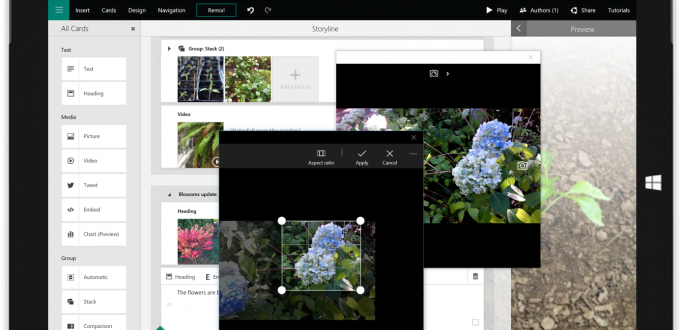
The beauty of Sway is that it dynamically decides how to best showcase your content. This makes it easy to quickly add content without worrying about the layout. The challenge is that Sway isn’t WYSIWYG. Instead, you add and organize content onto “cards” in Storyline View. Design View shows a preview of your Sway and lets you make broad design decisions, such as color/design theme or scrolling direction (horizontal or vertical).
As a result, understanding how different content choices will impact the appearance of your Sway can be tricky. It helps to go back and forth between the Design and Storyline View to see how different changes impact the design. You can also press the Play button in the top right corner to see your Sway exactly as your viewers will, including the animations that occur as content comes into view.
3. Be Photo Fabulous
Images are the connective tissue of your Sway. Pictures help break up the text and provide visual interest. Sway has several ways of displaying groups of images efficiently, including in a grid or a stack, so your presentation doesn’t get too long. Sway also lets you insert photos as small, moderate, and emphasized depending on the prominence it should have.
Use higher-res images to prevent pixilation on large screens. It’s best to use photos that are at least 1800 pixels wide for emphasized images. Don’t bother cropping images—instead, use Focus Points to tell Sway which parts of the image are important. Then, if the image is automatically cropped, it won’t cut out important areas (like chopping off the head of the featured person).
Lastly, choose images intentionally. Pitt-related images or pictures specific to your project are ideal, but don’t shy away from general graphics that reinforce the theme. Consider the color palette or image style of the other graphics you have selected to ensure consistency throughout. Sway will suggest images from Creative Commons that have no licensing limitations. You can also search for pictures from University Communications’ gallery of Pitt photos for download or from royalty-free sites like Pexels, Unsplash, or Pixabay.
4. Play With Color and Style
Sway will format your project by default, but there’s no need to stick with its first suggestion. Play around in the Design View to get a design that matches your desired tone. The “Mix It Up” button will apply a different theme and color palette so you can see different choices without having to pick specific options.
You can also customize your presentation with a specific color palette and typography. For example, you can specify Pitt fonts and colors to conform to the University’s branding guidelines. Another option is to create a color palette from an important image (such as the image on your Title card).
5. Emphasize Text
Highlighting a word and selecting Emphasize will bold and color it to help it pop. Using Accent will italicize the text to help it stand out in a more subtle way. If you Emphasize all of the text on a text card, it will appear as a block quote. Block quotes highlight text in a more impactful way, and are ideal for pull quotes, major themes, mission statements, etc.
Use Heading cards when introducing new sections or concepts. Not only does this emphasize the text and employ a feature image to set apart each new section, it will also form the table of the contents that users can employ to jump ahead in the Sway and see what the Sway covers.
Sway Away
Now that you’ve gotten an introduction to Sway and have benefited from my hard-learned lessons, it’s time to make your own interactive online stories. See how you can take your newsletter, presentation, or online story to the next level with Sway.
-- By Karen Beaudway, Pitt IT Blogger